Optim Case Study
A short masterclass in Storyboarding, Story mapping, Strategic Narrative and Brand Repositioning.
United Healthcare was launching its new provider interface. The new brand and platform were to be presented at a company and provider feature event.
I was presented with the initial speaker event outline and the objective to review, assess and see how to elevate the visual style to align with the new Optum branding.
When I reviewed content and understood the critical event objective, I saw the need to shift the strategy of story, positioning of content and underlaying messaging.
The following is an overview of the Storyboarding process I use when engaging with high-touch executive, event, sales and marketing presentations.
The process is not limited to presentation craft. I often use the underlaying thought process on much of my design work.
Step one - overall evaluation of the original content.
The event was a two-part objective: 1. Rollout findings which lead to the new portal development, 2. Highlight 3 speakers as content experts in the executive team.
I immediately saw the content was dense and distracting from a speaker focus relation. It did not offer the ability for the speakers to connect with the specific audience, reinforce the brand and healthcare framework.
The first step in the process was to review all content and screen with the filter of asking:
Why does this matter? (value, intent, reason, brand reinforcement)
Who is this intended for? (who is the audience and what level of understanding of the content do they have)
What are roadblocks for the audience to understand the content?
Is this purposeful? (is it sales/marketing myopic? does it relate to the audience core values)
You have to be willing to set aside your attachments and walk in the shoes of your audience - demographic, economic, cultural, political - every audience is different and complex. In order to connect, you must see though their eyes.
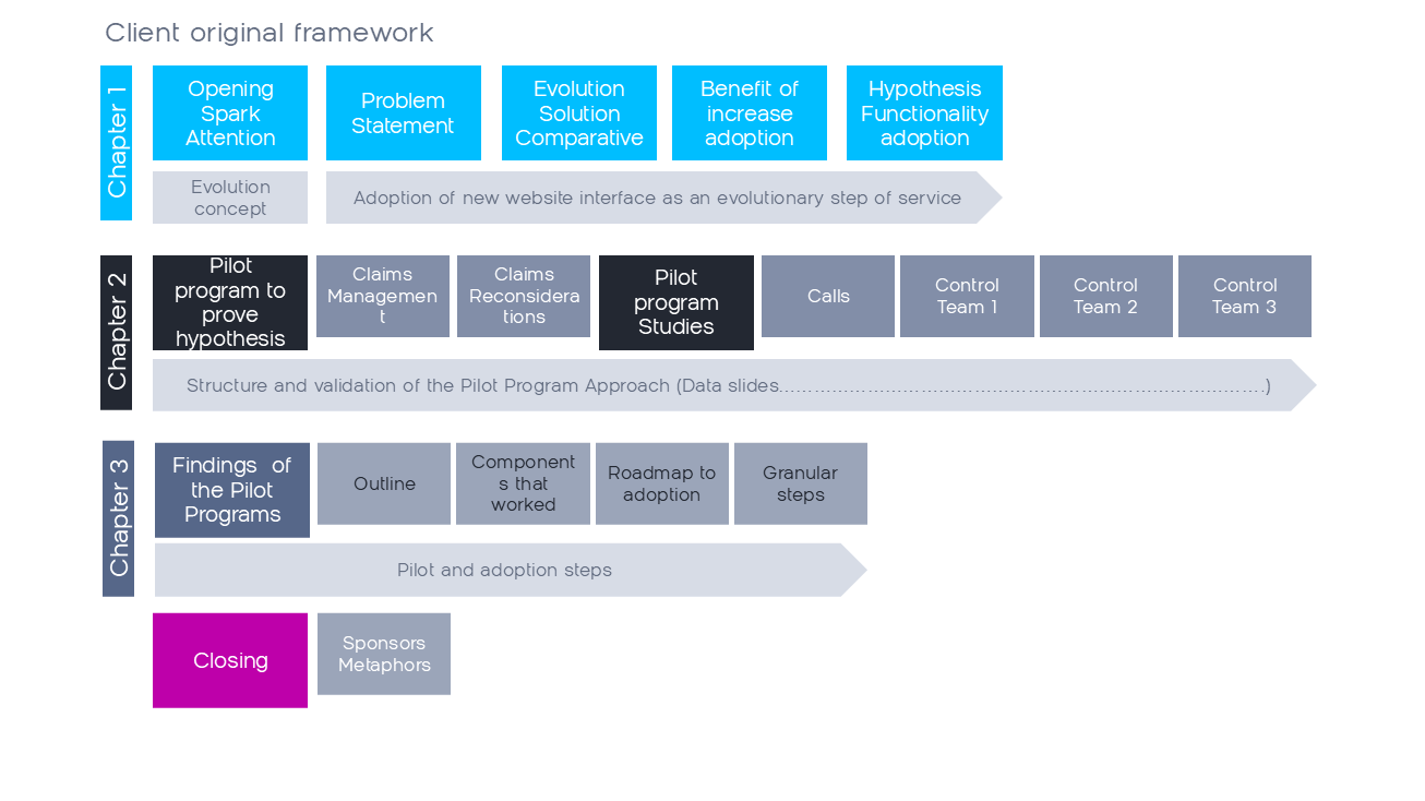
You’ll see one image that quickly caught my eye - the Evolution graphic. Metaphors can be useful if positioned correctly. In this instance, it was a red flag. Some members of the audience are faith based. Yes, they would understand the implied metaphor relation - evolving the prior platform to a new evolution of the platform, but that’s not the cause for concern. What we do not want is any moment of distraction where the audience pauses to reflect on an internal dialogue. That pulls their immediate attention from the speaker’s connection. It breaks the critical connection.
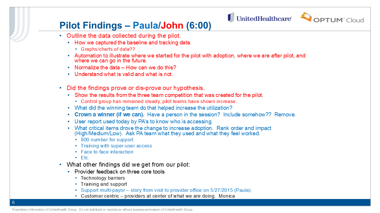
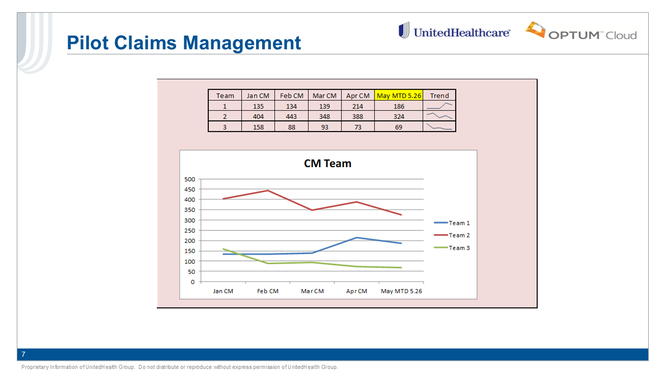
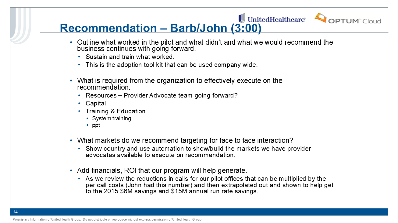
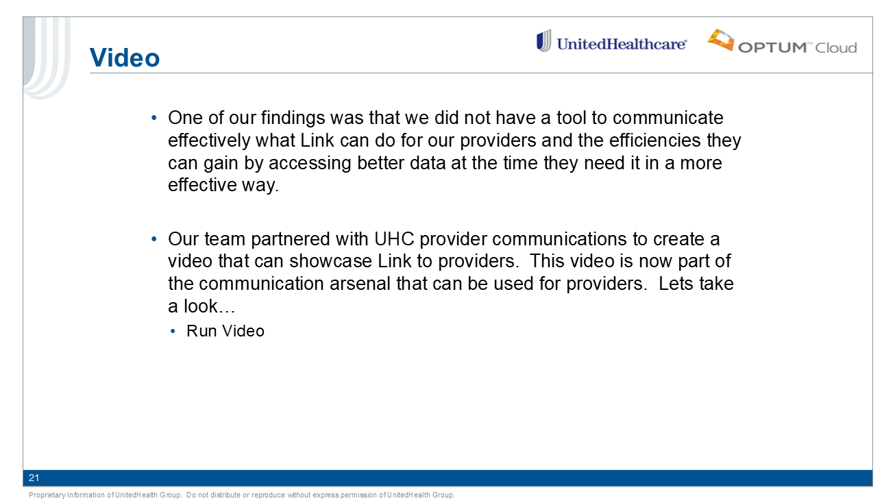
Below are original content slides
Step two - storyboarding and story mapping.
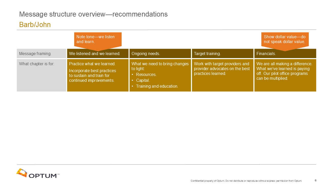
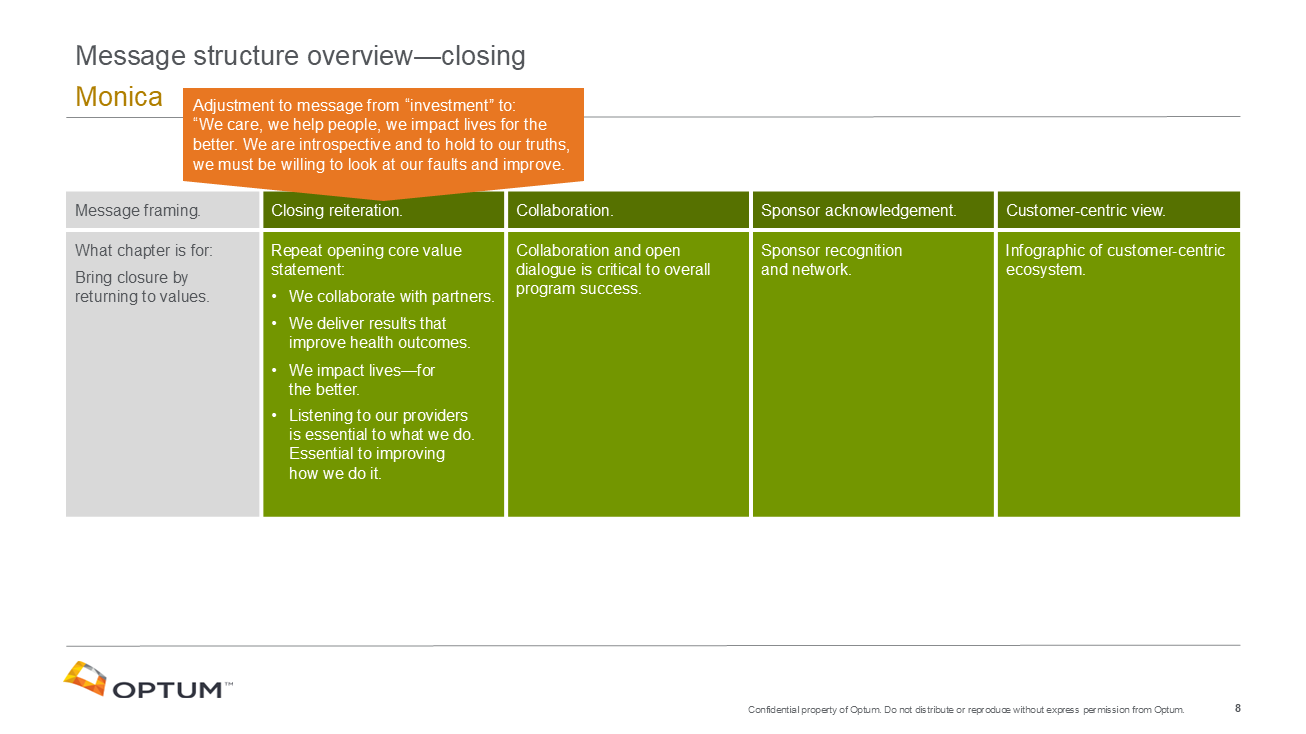
My approach was a fundamental shift in the entire speaker dialogue and content-to-context relationship. I mapped out the existing content at a 90,000 ft perspective to show its relation and flow of content, then created a new story map and foundational arc while reframing the entire messaging narrative to be a humanistic extension of the brand’s underlaying value. This was a foundational shift and required the speakers to understand the expressed value tone adjustment. I created key word phrases which distilled the underlaying message as brand statements and changed the overall need to present dense data into infographics which explain the studies and results in a diagrammatic process flow.
These critical adjustments shifted the delivery of information to a brand reinforcement of core values - it built a bridge so the message and speakers can connect to the audience in an authentic and meaningful way.
Below are the before and after story mapping diagrams used to explain the methodology and provide a step-by-step review process.
The storyboarding process helps to convey the overall idea quickly and see how the parts fit and work to build a connective story arc.
Step three - Narrative and art direction.
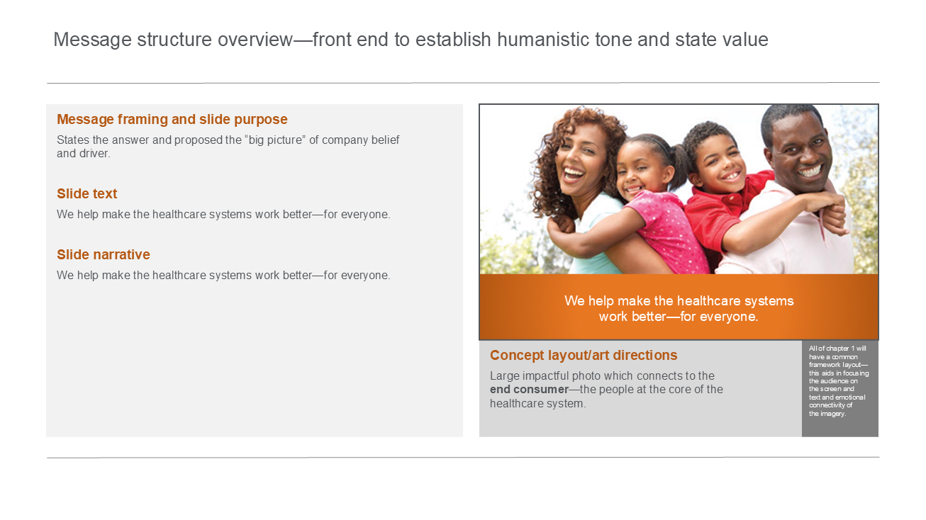
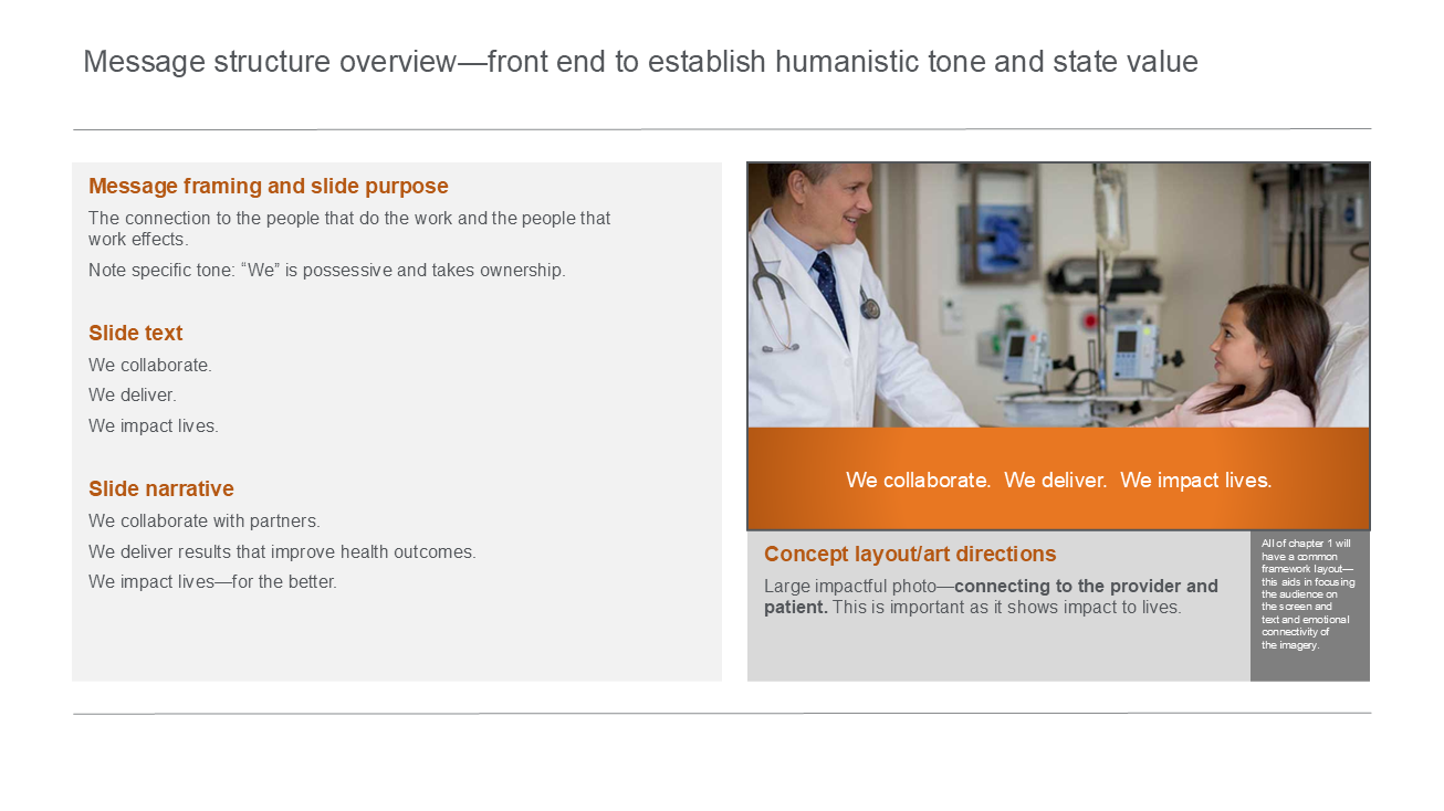
Once the storyboarding was approved, I stepped into a complete rewrite of the speakers dialogue to align with the reframed value positioning and overall event objective. This was critical to provide the speakers on how the values are expresses and link visually to brand.
Its where I craft the humanistic tone.
This is essentially a build out of the story mapping - stepping into the 30,000-foot perspective. It presented a clear outline of each slides purpose and association to the story mapping architecture and the intended style.
Each slide now must run through a validation check list:
Is the content purposeful?
Does the content and speaker narrative relate critical information that builds the story step-by-step?
Is there an overarching connection that justifies each individual component and how it relates as a whole?
Is the visual supporting the speaker or distracting the audience’s attention
The final step, custom build out of the executive event presentation.
This is only possible once Content + Audience + Engagement is fully understood and brought into alignment.
The final event deliverable was a success and elevated not only the speakers, but audience brand reception and understanding of the critical core reasoning for the new portal and value to employees and providers.
The presentation also set new standards for the internal and external brand expression and values.
Below is a video of the final deliverable executive presentation as a visual support to the spoken narrative (time compressed).


